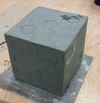
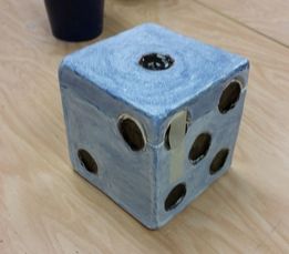
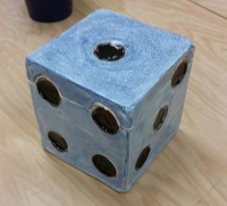
 In-Progress 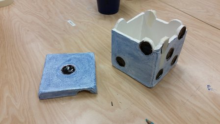 I made a clay box that looks like a die. My process was to make a cube with sides of equal length and width. Then I carved circular dents into the sides to represent the dots on a die and cut a lid around the top dots. I was inspired to create this piece because I thought that carving the lid around the dots in a die would make for a creative and interesting design for a clay box. What I found most successful about my piece was the shape of the cube and the way I cut the lid out. If I were to do this again, I would definitely change the way I did my glaze. First of all, I would have used a specific glaze for the whole piece so that the colors are consistent and I would be more careful to not get glaze between the lid and the base so that they don't stick together in the kiln. I would sign up for sculpture class if I could, but I don't have enough classes left to fit it in with the classes that I need for college requirements.
0 Comments
Process:
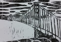
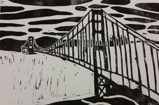
I incorporated the theme of lines into my piece as the suspension cables in the bridge. The thing I found most successful about my piece was the contrast between the black and white and the depth. Something that I would change if I were to do this again would be to try to have cleaner cuts in some areas by including less detail in some areas to minimize mistakes. Also, I would probably add more detail to the water to make it flow better with the image. 
Portrait as a Still Life
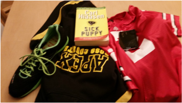
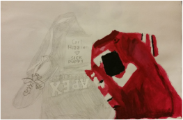
The items I chose were a running shoe and my Apex Cross Country sweatshirt which represent my devotion to running as I am on the cross country and track teams, a book by one of my favorite authors because I love reading, my Ohio State football jersey because I love watching football and Ohio State is my favorite college team, and a phone because I take my phone everywhere I go. I found the small details such as the folds in in the football jersey and the words on the book to be most successful because they make the painting look more realistic. Something that I think I could've done better was add more depth to the painting by including more shading because some parts of the painting look plain and two dimensional. I picked acrylic for this painting because I found it easier to paint small details and smoother edges on the different items with this medium. 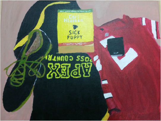 Finished Piece The Idea of Place
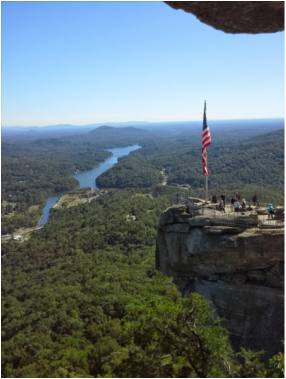
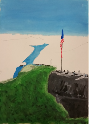
The place I chose was Chimney Rock and Lake Lure in Rutherford County, NC because one of my most favorite vacations that I've ever been on took place here and I was able to take some great photographs there including the one above. The thing I found most successful about this piece was the way the rock, people, and flag turned out because I feel like it really displays the scale of the location. Some things I would change would be the way I blended the colors in the background because they don't blend well enough in the final piece and I would change the way I did the shading because the way that my final piece is shaded makes the image look kind of flat. The reason I chose watercolor as the medium for this painting is because I thought that it would produce a better arrangement of colors for the trees, which make up the majority of this image. 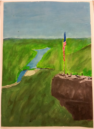 Finished Piece Mentor - Tess Wiegmann
Website - http://tess-apex-2017.weebly.com/art-4 Background/Interest in Art - Wanted to take art to become a better artist and thought that they should take at least one art class every year. What I'm Looking for in the Mentor Program - I would like to get better by learning some tips on adding small details that can be used to make my art pieces more realistic and dynamic or proportional. Two in One Pencil Drawing I morphed a sunfish and a post-2013 penny because the shape of a sunfish is much like the shape of the shield on the tails side of a penny. I first drew a pair of concentric circles to create the outline of the penny and then fit the sunfish's outline in the same area that the shield would sit on an actual penny, but had the fins go outside of the penny's outline. After that, I put the words "United States of America" behind the sunfish and the banner with the words "one cent" in front of the sunfish to make the sunfish appear like it was on the penny yet was overlapping some parts of it to make it seem more surreal. I tried giving the penny flat shading and shaded the sunfish the way it looked on my reference. I think the most successful part of my drawing was the placement of all the parts of it and I would change the way I shaded it because the pencil smeared too much. I think I should have chosen a pen drawing as the medium for this picture because the way I shaded it with my pencil makes it look like it is unfinished in some parts and a pen would have given a more smooth texture to my drawing. 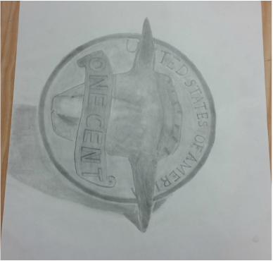
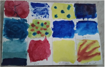
 Charcoal Drawing The advantages of drawing with charcoal is that it is easy to erase and change things to touch up the drawing, which makes it easy to shade. The disadvantages are that charcoal doesn't stay on the paper very well and smudges easily and it is very painful for my ears when applying charcoal to the paper.  Pen Drawing Some advantages of drawing with a pen is that the drawing gets a very nice and artistic texture which can make it seem more realistic. Some disadvantages of a pen drawing are that it takes up a lot of space on the paper and needs to be very large to look good. Also, mistakes are not easy to correct and pen can't be erased. 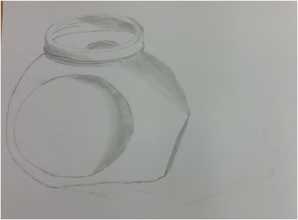 Pencil Drawing The advantages of a pencil drawing are that it erases easily and smudges to make a nice transition between shades when needed. A disadvantage of pencil drawing is that it is quite difficult to get a light shade with a standard pencil. 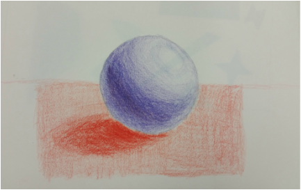 Warm-Up
The warm-up that I learned the most from was when we shaded a sphere with colored pencils, because I learned how colored pencils could be used to shade a drawing. |
AuthorWrite something about yourself. No need to be fancy, just an overview. Archives
January 2017
Categories |
 RSS Feed
